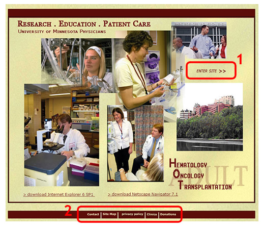
Comment on opening page (Figure 1)
The images functioned well in capturing my attention. The links about Browsers at the bottom made me think for awhile. What id the user is on an Apple machine, and uses Safari or Firefox browsers? The designer could have inserted a Javascript for browser & operating system detector. This would eliminate the possibility of EVERY user entering the site and having to pause a moment to think which can be distracting.
The next question that came to my mind was -"Where do I go from here?". I did not catch the ENTER HERE link till the end. The images overpowered the "Enter Here" link.
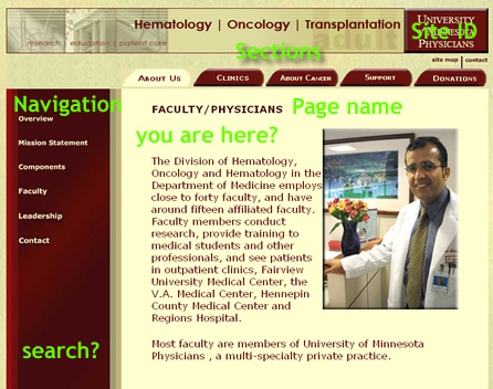
Site ID (Figure 2 & 3)
Site has logo identity on all pages. Could it have been placed on the left side of the page? Page Name
Good use of page name Bold Title with caps is a good contrast and eye catching. Major Sections
There are 3 major sections Local Navigation
Navigation is placed on the left
that applies to current page. Good use of colored tabs to inform the user the current page location. "You are here?"
It would be helpful to add breadcrumbs.
About Us> Overview
About Us>Faculty How can I search?
A search & help functionality would help with this site. This can grow to be a huge site.
|

