Comment on opening page (Figure 1)
The images functioned well in capturing my attention. Next the links at the bottom made me think for awhile. The designer could have out in a Javascript for browser & operating system detector. The next question that came to my mind was -"Where do I go from here?". I did not catch the ENTER HERE link till the end.
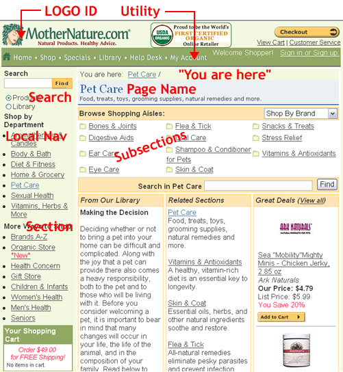
Site ID (Figure 2 & 3)
Site has logo identity on all pages. Nice consistency.
Page Name
There is a title on each page Major Sections
There are major sections and subsections (aisles). Color contrast of the boxed areas helped identify subsections.
Local Navigation
Left bar navigation is consistent on all pages in alphabetical order.
"You are here?"
Breadcrumb application well defined How can I search?
Search and sub search functionalities available. Designer could have ommitted the word find - reperition is redundant. (Krug p67).
Miscellaneous Comments
Good application of utility navigation links. The Shop link page could have been alphabetize as well. That way the consistency of alphabetical order can be maintained.
|