SCREEN DESIGN PRINCIPLES 2 ( 4 Basic Principles - p1 of 2)
The four basic principles in design are alignment, proximity, repetition, and contrast. (Based on Williams & Tollett (2nd Edition), and Lynch & Horton - Web Style Guide) Alignment - is how items are lined up on a page in relation to each other.
- Horizontal and vertical alignments, example button or text navigation items placed on the page are both equally important.
- Items can either be left, right or center aligned. They must look well balanced on a page. Consistency in alignment is a unifying force
- In imbalanced page have all items to aligned to the left with lots of white or negative space on the right.
- Use of indents or margins can give the audience a "visual relief" or "breathing space". This adds visual contrast - positive & negative space, thus adding interest to the page.

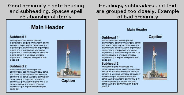
Proximity - refers to how items placed on a page relates to each other in spacing or distance.
- The grouping of items give a sense of organization and hierarchy information . Similar items should be grouped closed together. Spacial relationships communicate the relationship of items. For example, captions should be placed closed to the graphics, or headlines should be placed close to their related body text.

NEXT PAGE |